poster design
typography
print
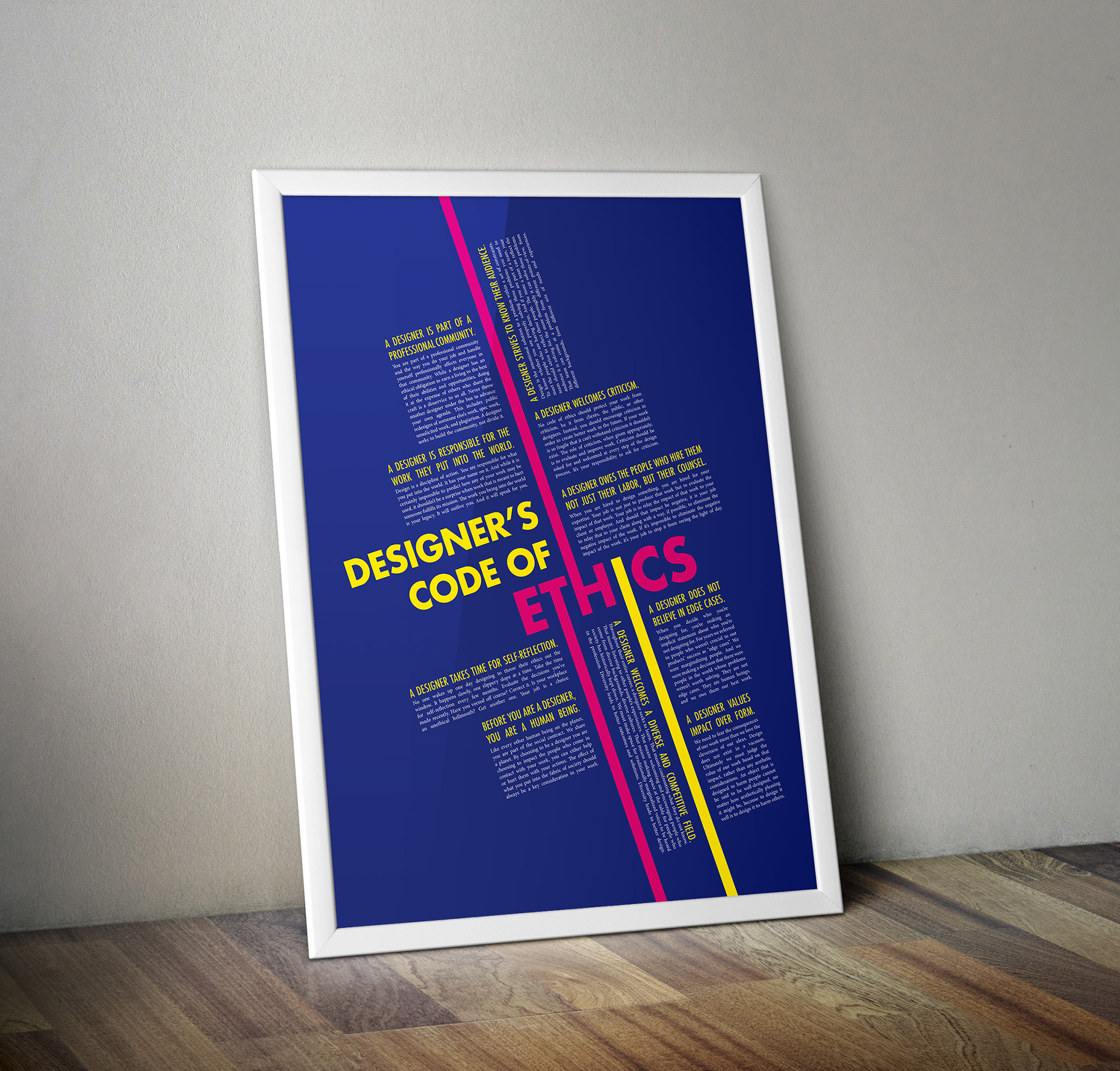
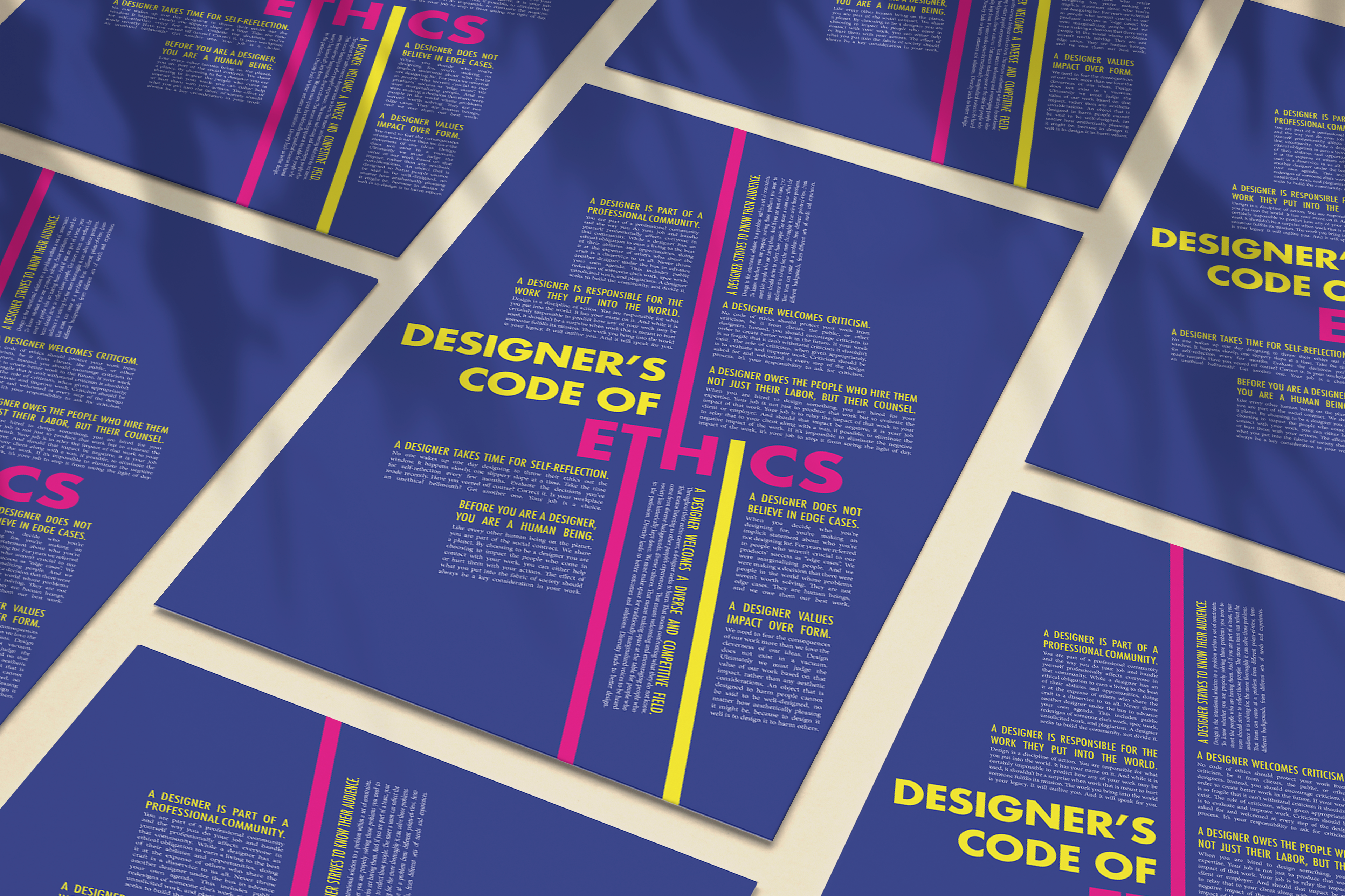
Reflecting on the manifesto and the essence of being a designer, I wanted my poster to embrace a “return to fundamentals” concept. Since the poster would be printed, I believed that using CMYK as my colour palette would align perfectly with this idea. In terms of typography, I opted for Minion Pro, the default font in Adobe InDesign, a widely-used tool in our field. For the title, I chose Futura, a typeface designed by Paul Ranner, owing to its historical significance and geometric shapes. This decision complemented the overall design of the manifesto, constructed using justified text blocks.


