poster design
print
risograph
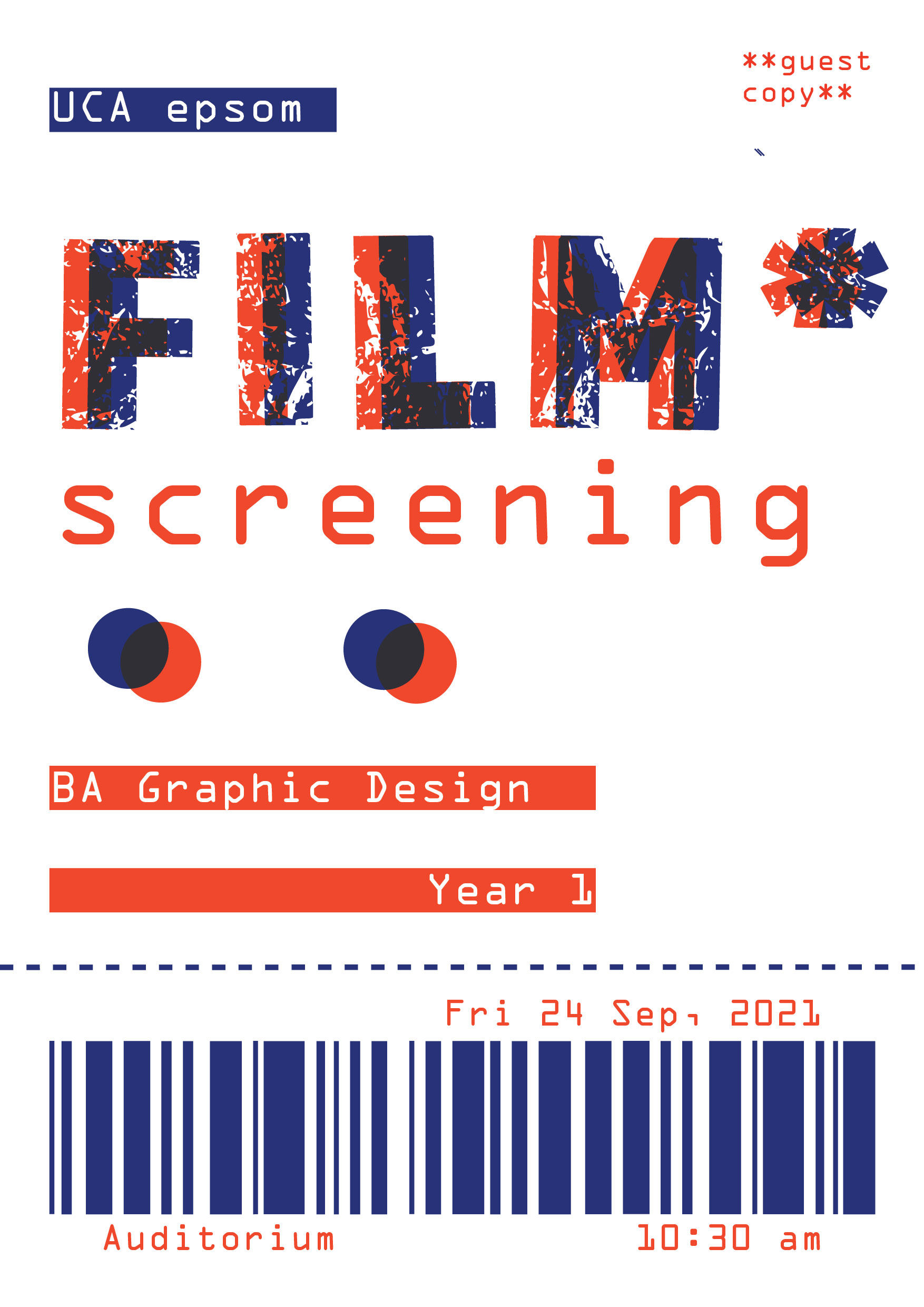
Selected to create the poster for the end of year 1 film screening, I opted for a design that explores the conventional concept of a “film ticket,” with all the relevant details arranged in a traditional hierarchy.
The colour palette I deliberately selected aligns with the printing method planned for this poster, utilizing the risograph. By overlapping blue and red, a third colour emerges, imparting the design with a sense of depth and texture. The intentional colour choice enhances the visual appeal, creating a unique and captivating aesthetic for the poster.

riso-printed


