data visualisation
print
typography
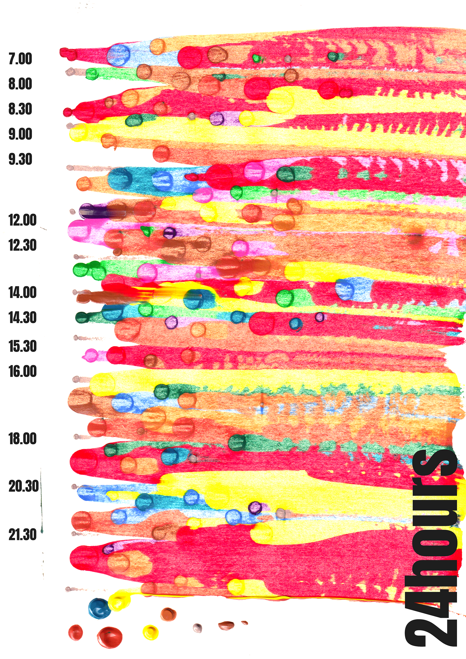
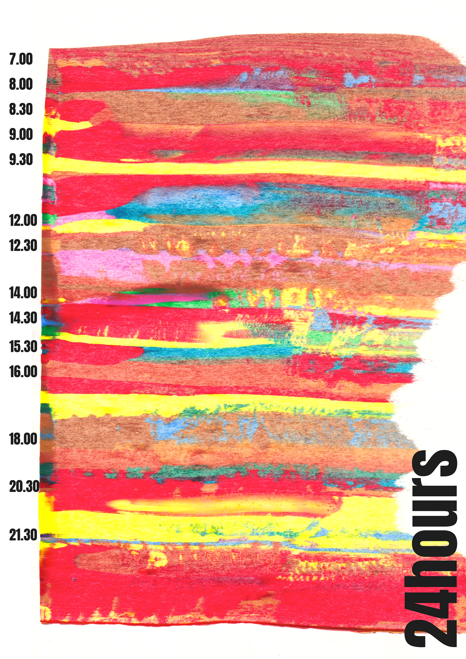
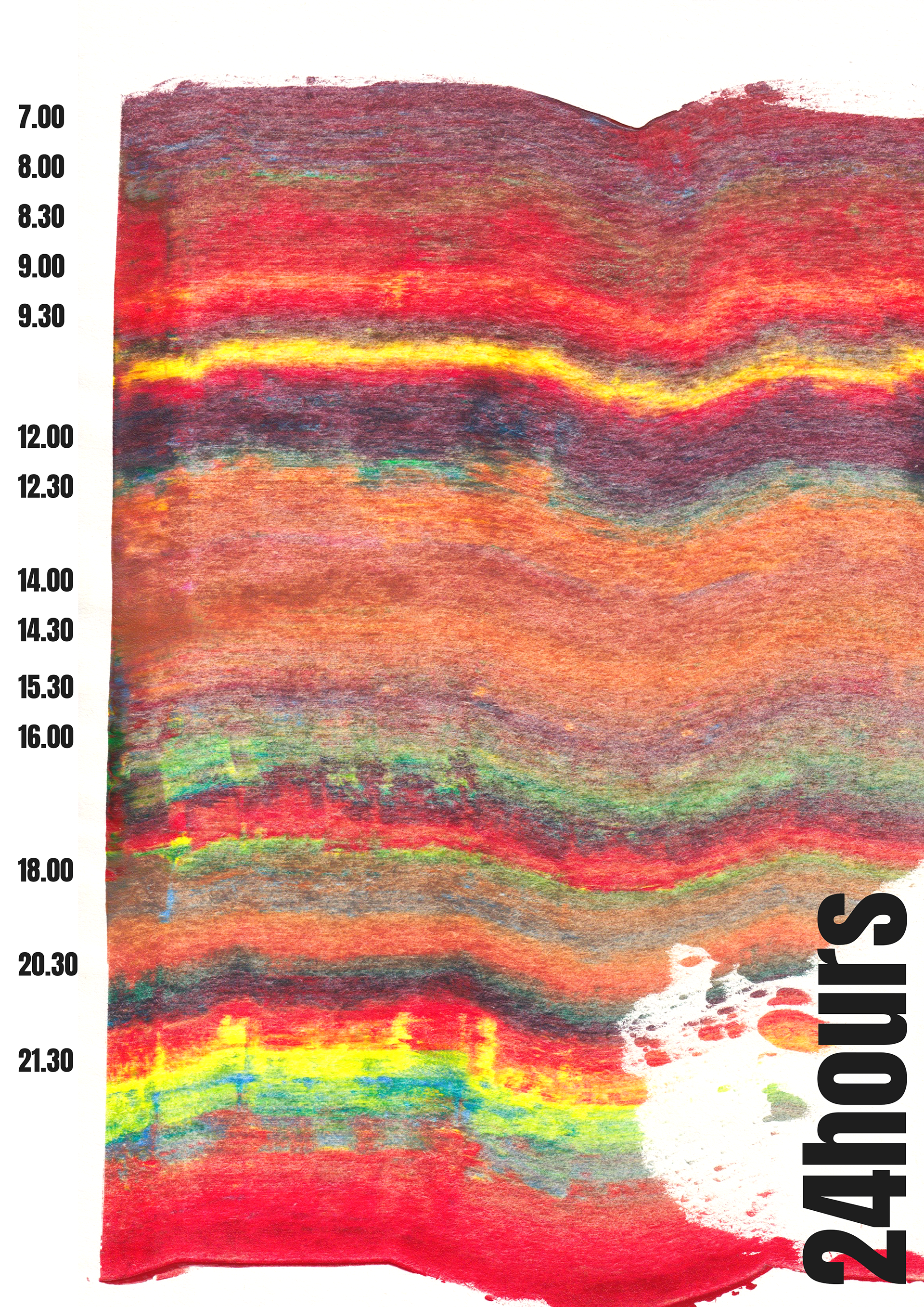
For the task of visually representing my activities within a 24-hour period, I decided to focus on the colours that surrounded me throughout the day. I took photographs to document my experiences and extracted the dominant colours from each photo.
Transforming this raw data into a visualisation, I categorised my design outcomes into three main groups: green, blue, and red, extracting the respective colours that matched the timeframe for each part of the day. Each shade and tone harmoniously merged, revealing a visual narrative that encapsulated my unique journey. It was an artistic exploration that allowed me to intimately understand the chromatic aspects of my daily life.
As part of my experimentation, I create a design in which I used acrylic colour and a squeegee to create the pattern, which afterwards I scanned and digitally added the type. Each colour in the final design matches the timeframe in which that colour was seen during the 24-hour period.
