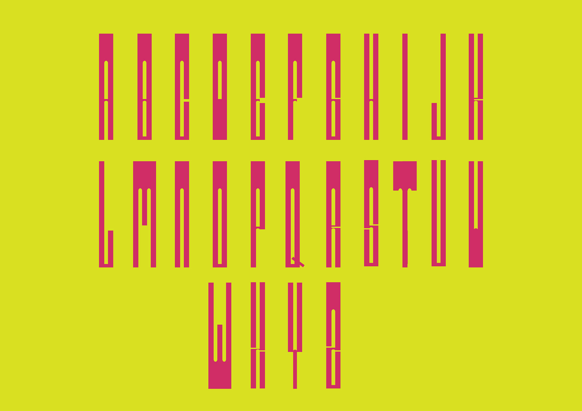
type design
typography
letterpress
print
Designing a typeface based on the iconic Elizabeth Tower and Big Ben was an exciting and challenging endeavour. Through careful observation of its architecture, I meticulously created a grid that mirrored the elegant curves, sharp angles, and timeless beauty. This helped me create each letter that exuded a sense of strength and sophistication, capturing the essence of the architectural marvel.
It was a rewarding experience to merge typography and architecture, which I wanted to push even further, therefore I created wood letterpress type for a truly remarkable outcome.


