poster design
campaign
typography
letterpress
print
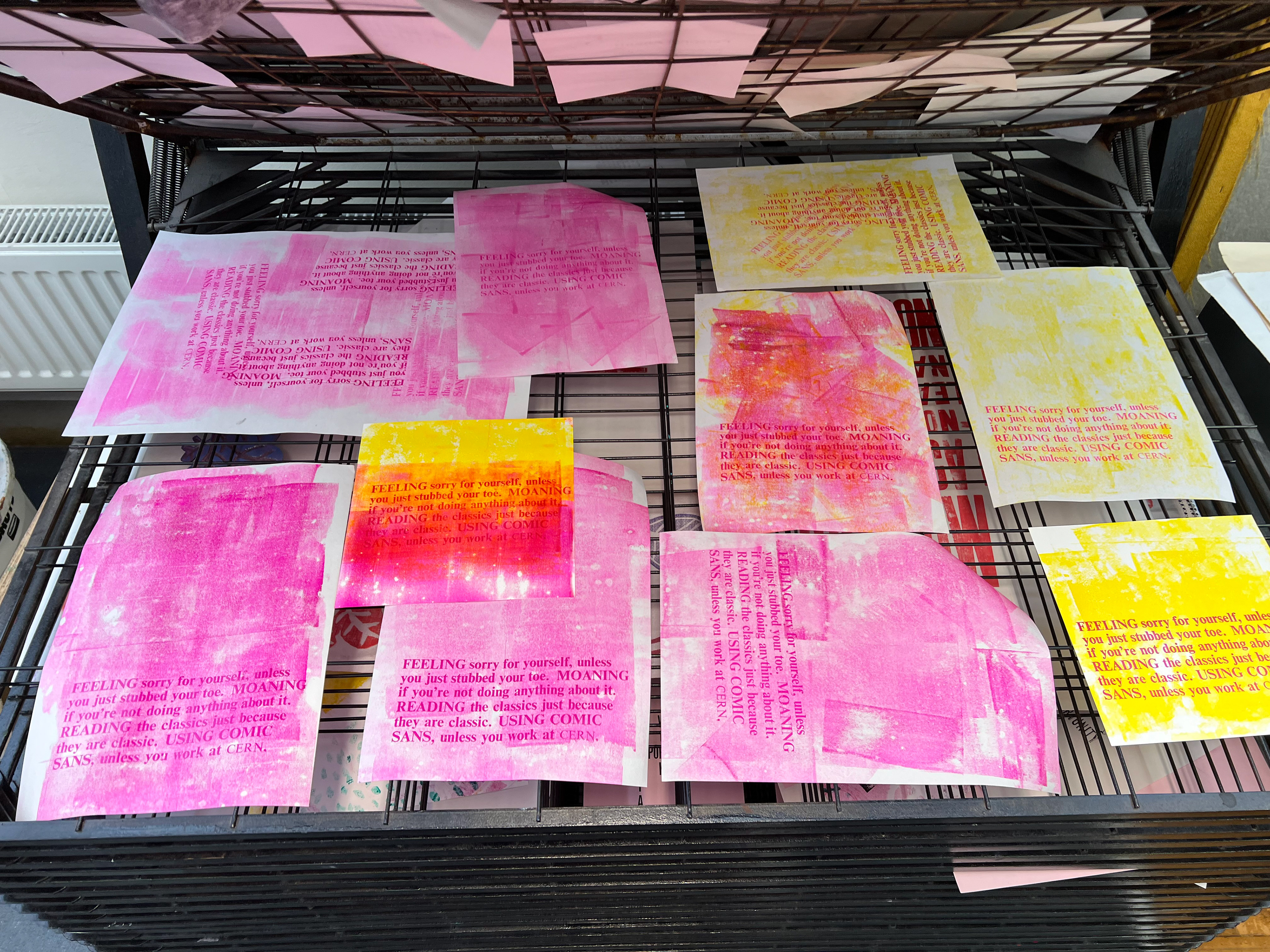
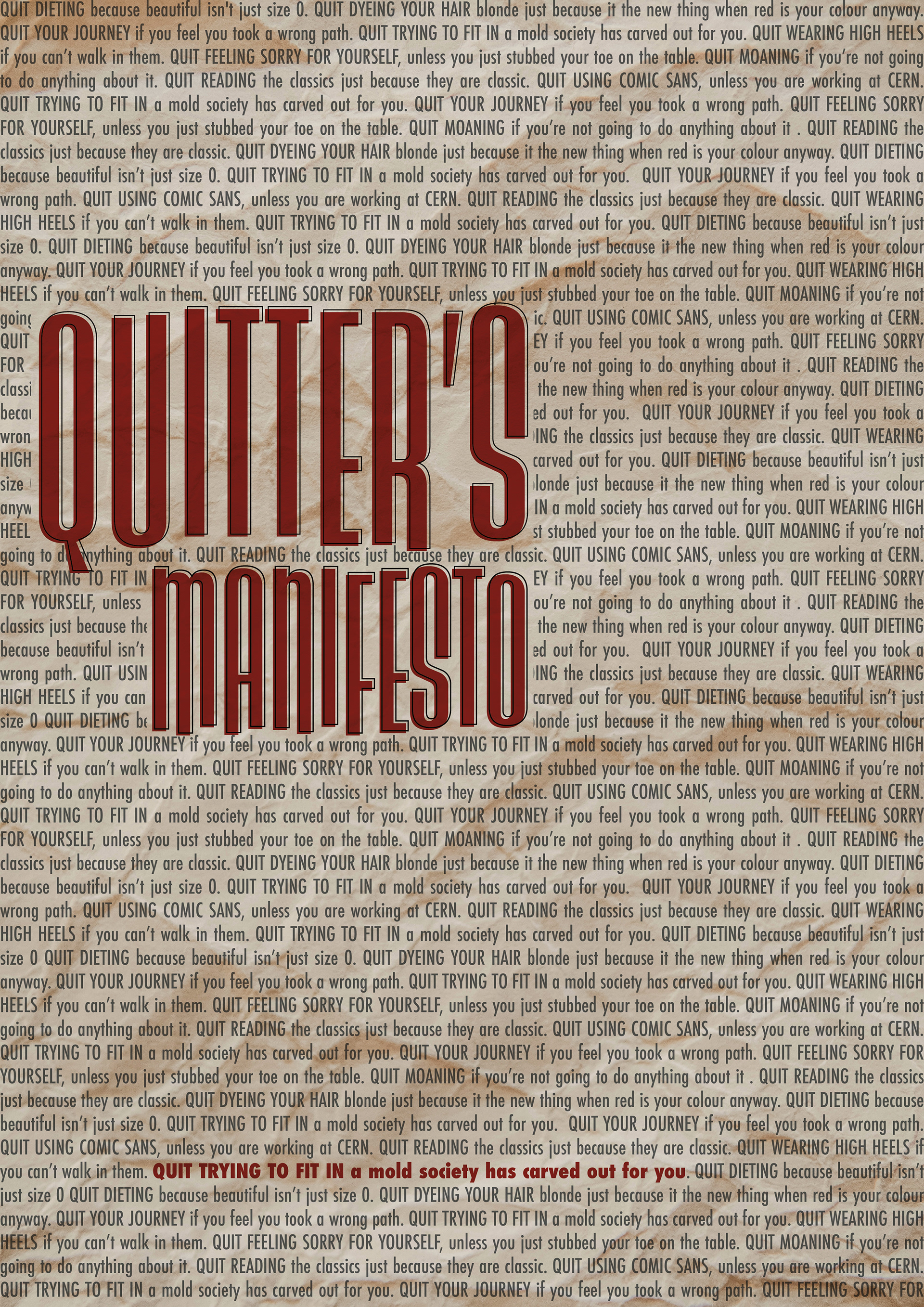
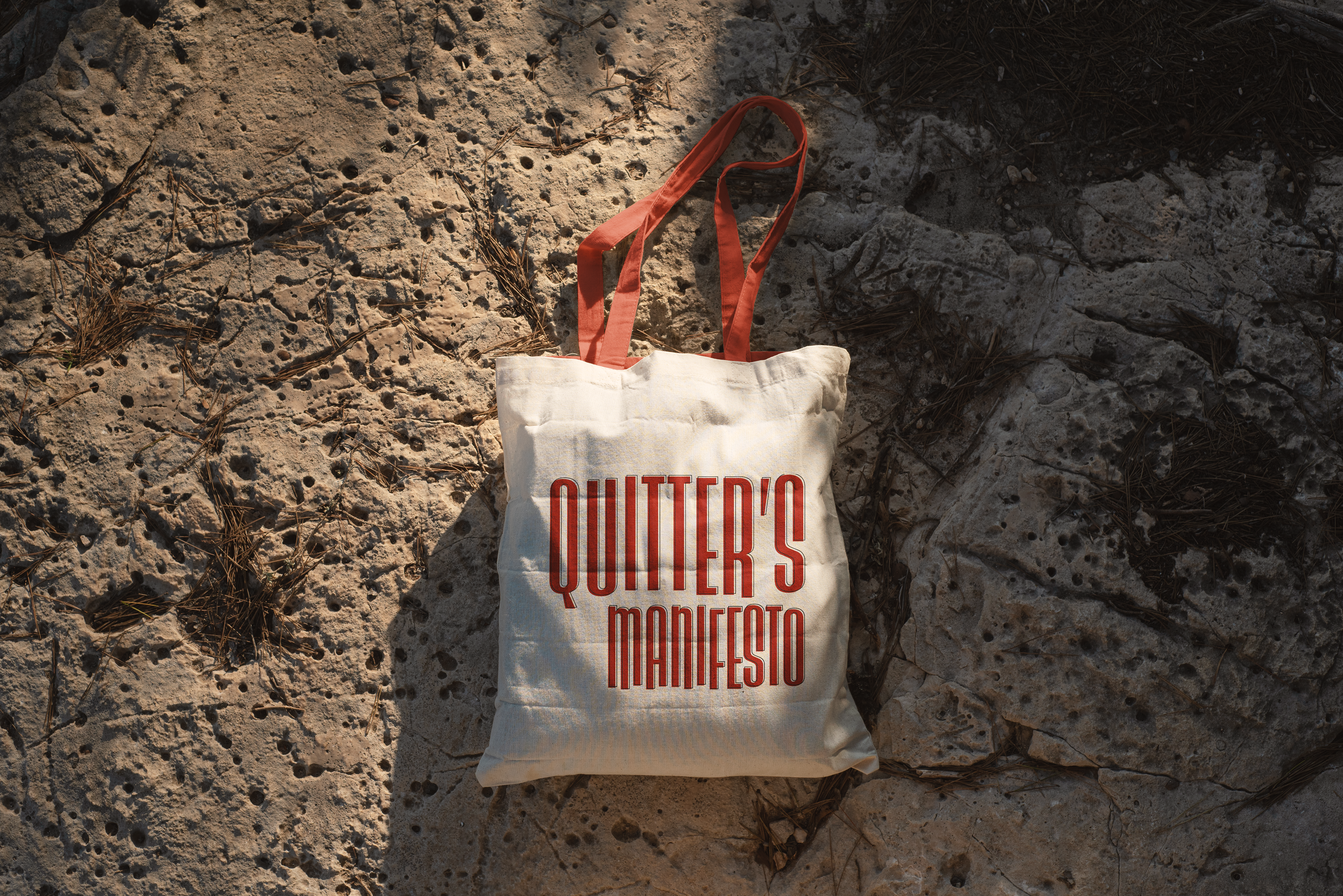
When tasked with creating our own manifesto through graphic design, I decided to take a sarcastic approach. I wanted to challenge the notion of blindly following established norms.
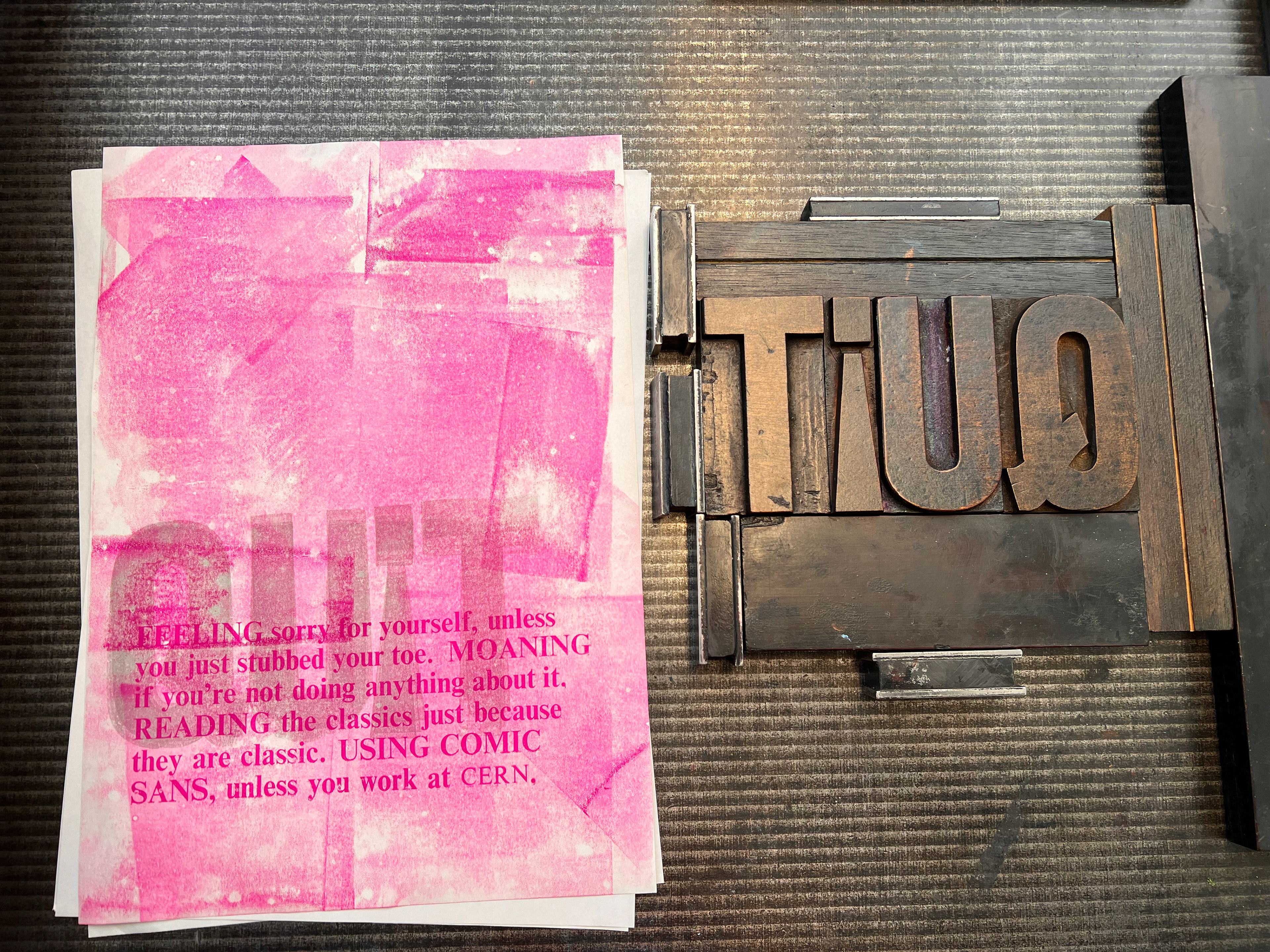
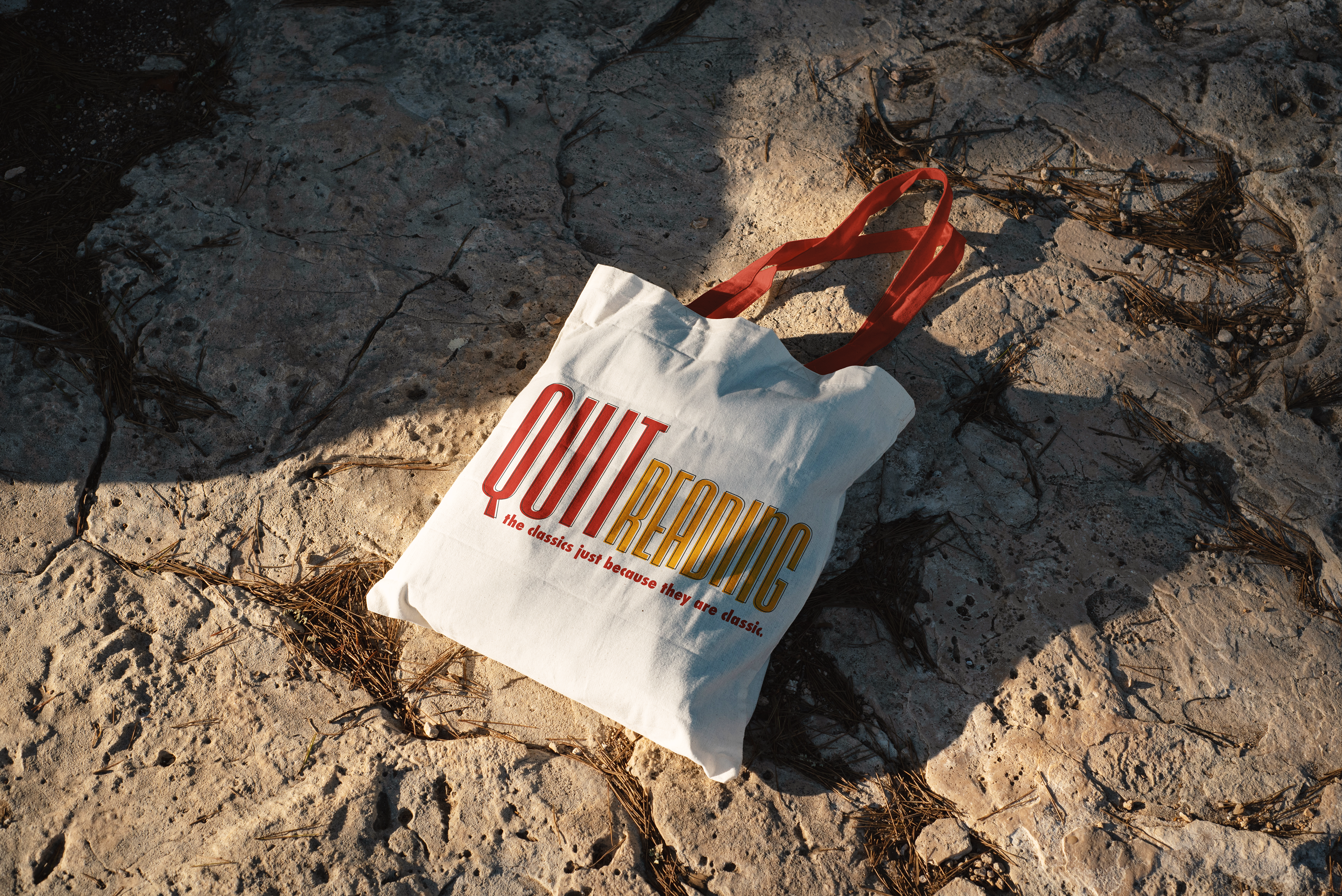
My design began with bold statements, like “Stop reading”. But instead of leaving it at that, I added explanations to spark introspection like “the classics just because they are classic”.I aimed to encourage critical thinking and question the unquestioned. By juxtaposing strong assertions with tongue-in-cheek explanations, my design aimed to provoke thought and ignite conversations. It was a bold and unconventional approach, but it allowed me to express my unique perspective and challenge the status quo.



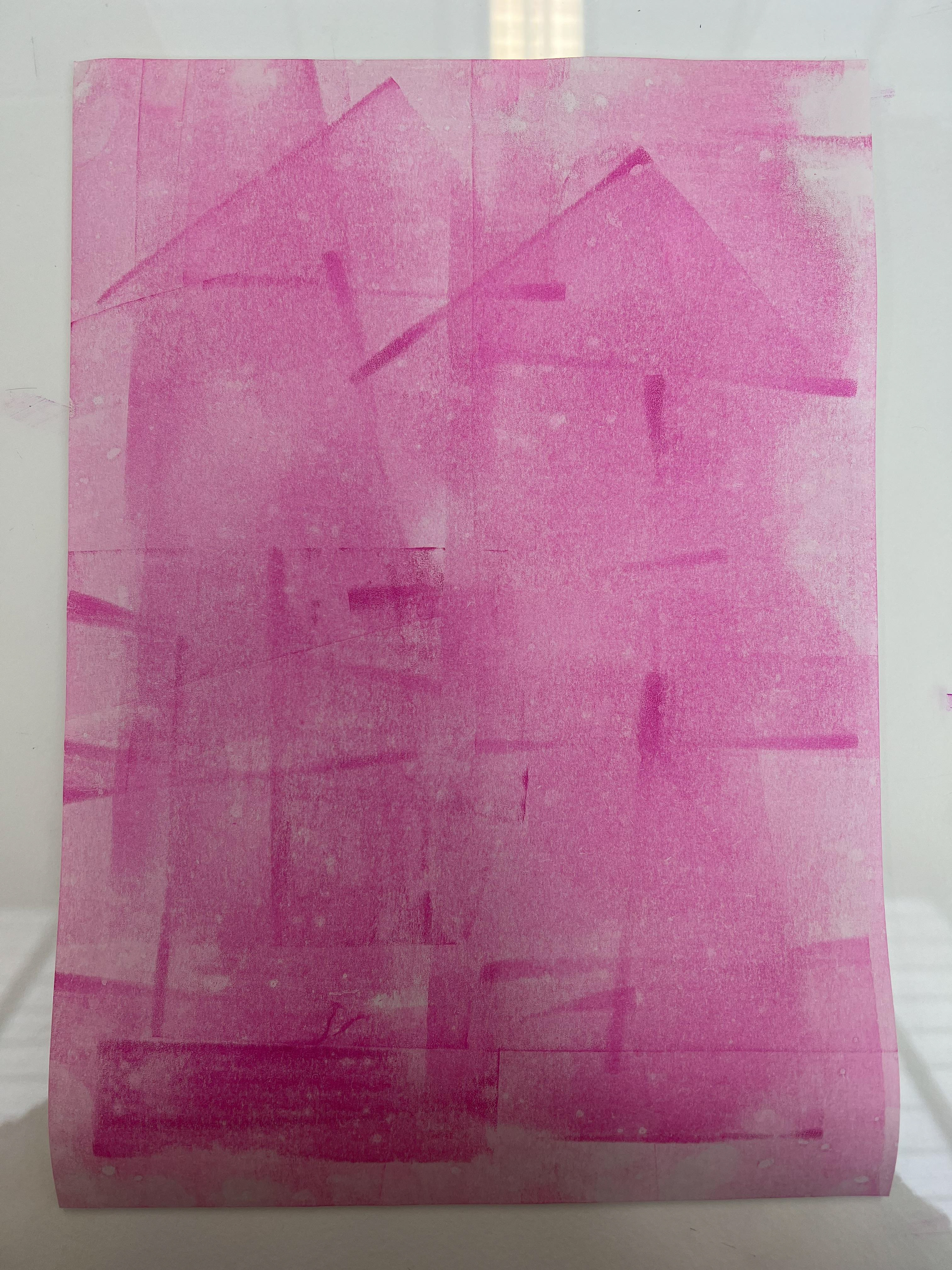
As part of the experimentation stage, I used the Farley press to print the manifesto. I chose a 26pt. metal-type which I set on the letterpress, I then created different paint-pattern backgrounds on which I printed my text. As I didn't have enough letters at my disposal, I only printed half of the manifesto and decided to not use the word 'quit' before each phrase, instead opting for a wood type in a larger weight as a bold statement.
